dESIGN
I consider print page design to be one of my biggest strengths as a journalist. Story-telling, after all, is not just about words, its about truly telling it, through visual elements and all. For all of my pages, excluding our special election issue (Vol 37, Issue 2) I have created all of my own art and Infographics to accompany the design. I use these skills to further elevate the excellency of story-telling I pride myself on.
PRINT DESIGNS
Vol 37, Issue # 5
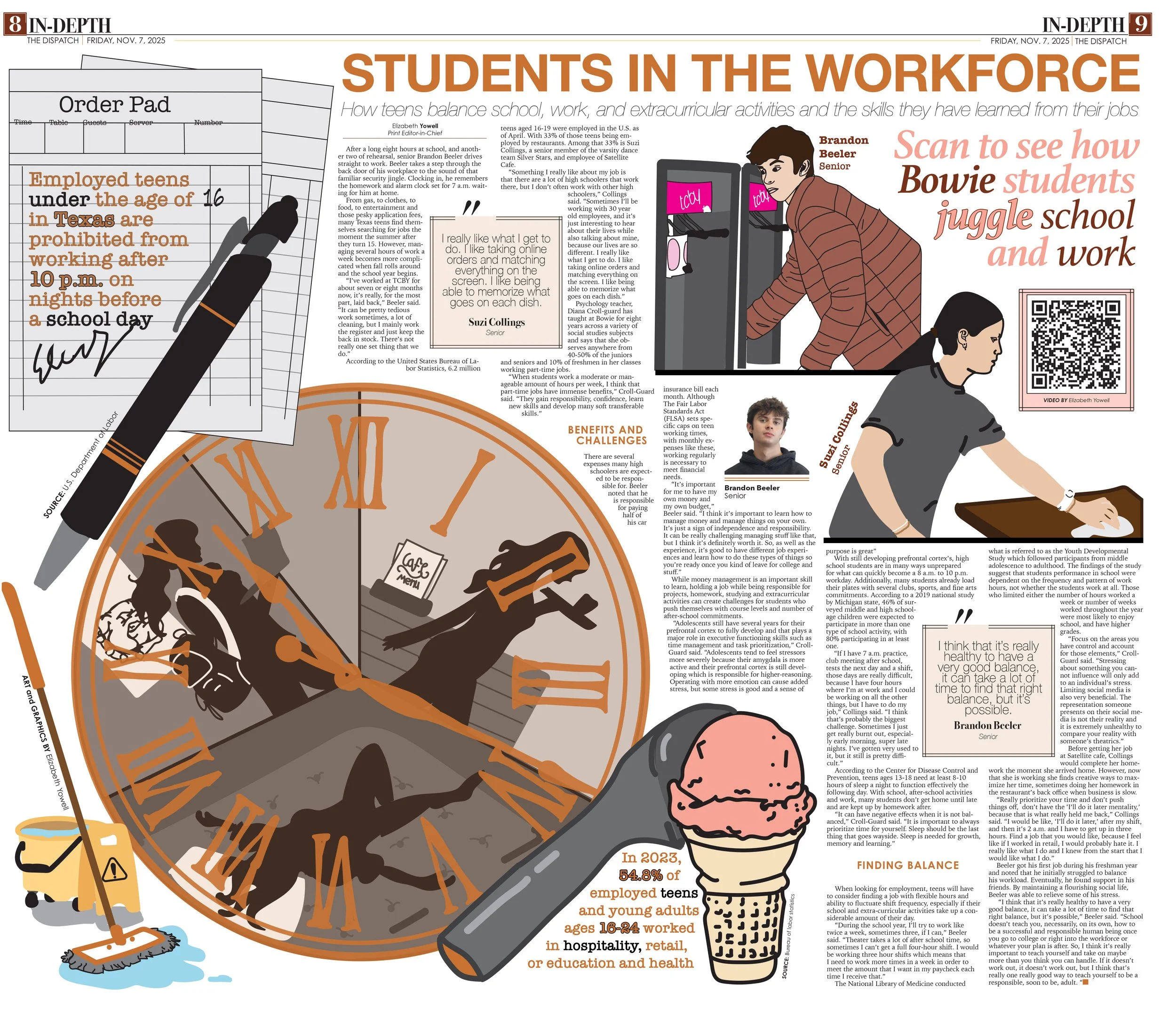
Vol 38, Issue # 1
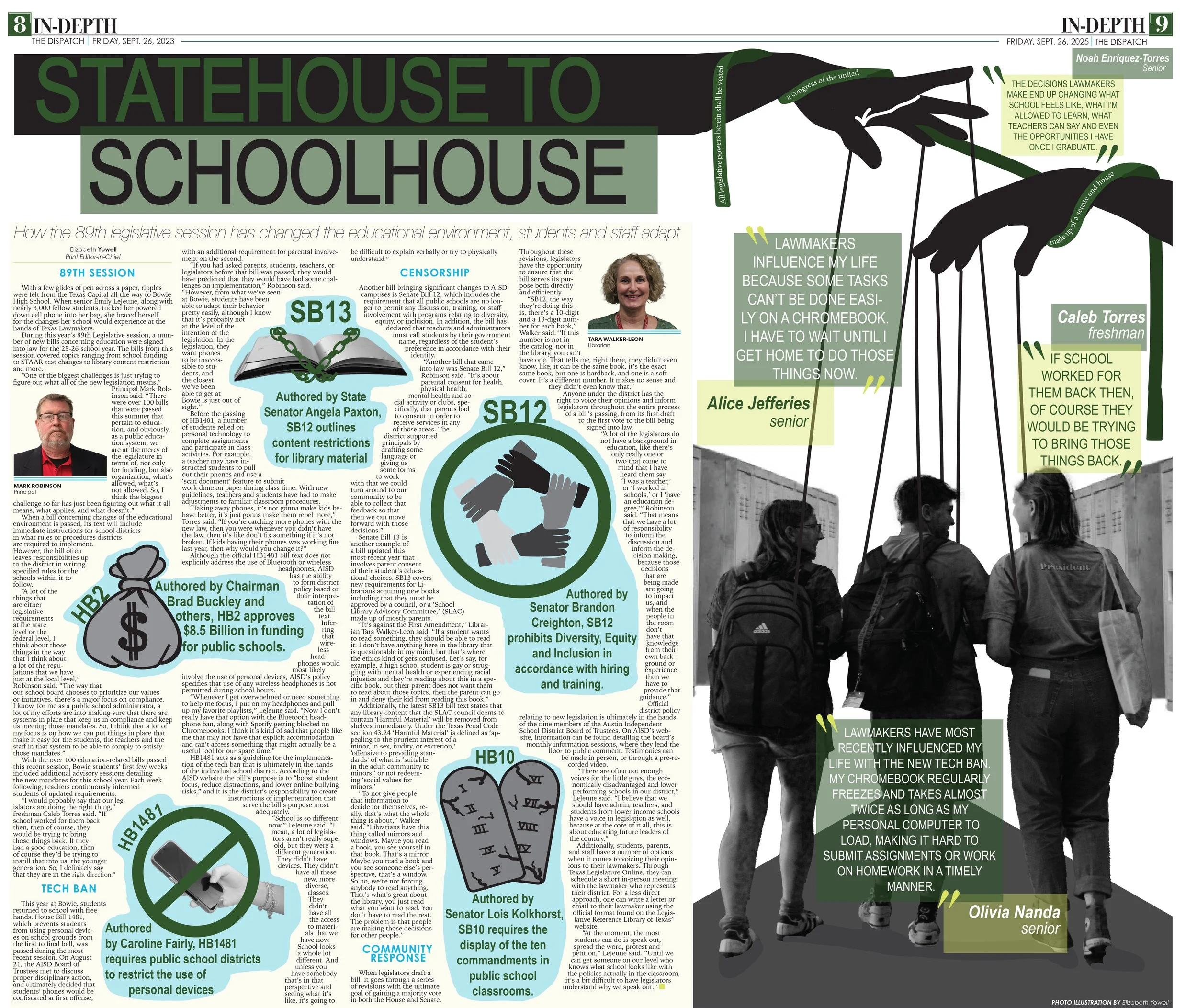
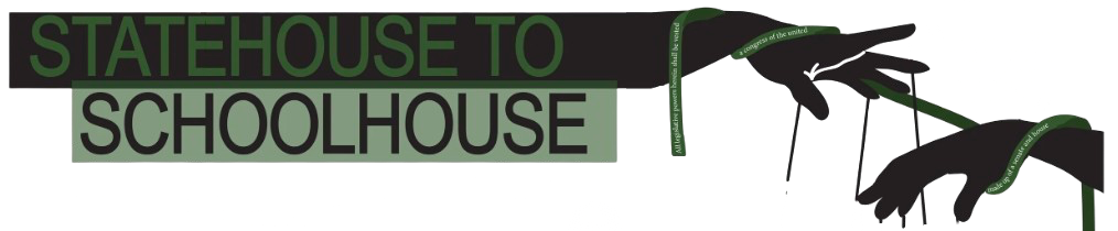
At the beginning of this school year, our district had some really impactful legislative changes that I knew I wanted to cover extensively. I wanted my story to provide readers with hard hitting facts that speak for themselves, but I also wanted to convey that these new laws were effecting students in drastic ways. I chose to convey this through my design, communicating the consensus among many students that they felt they had no say or control over how these new laws were effecting their education through the visual of puppet strings.
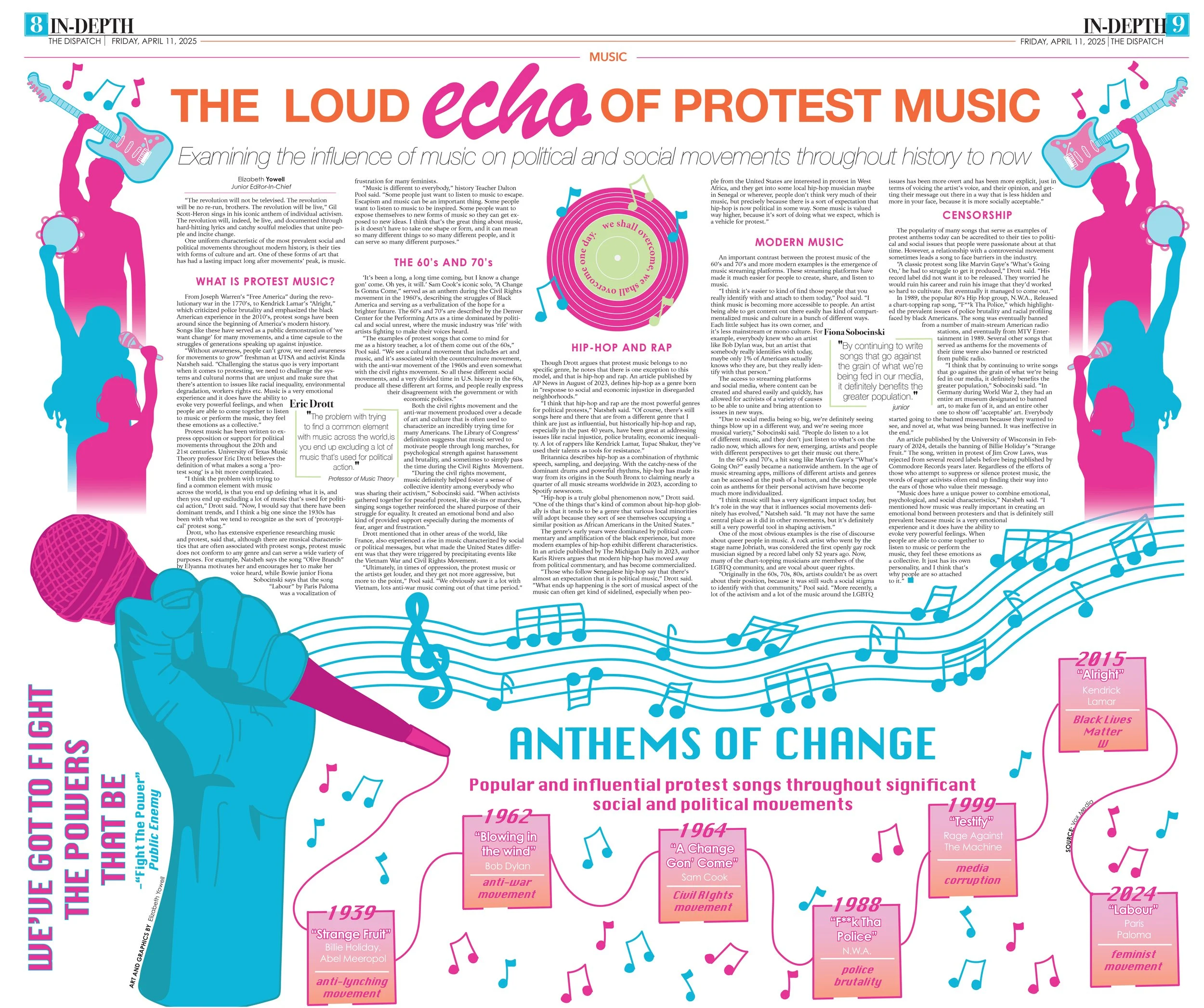
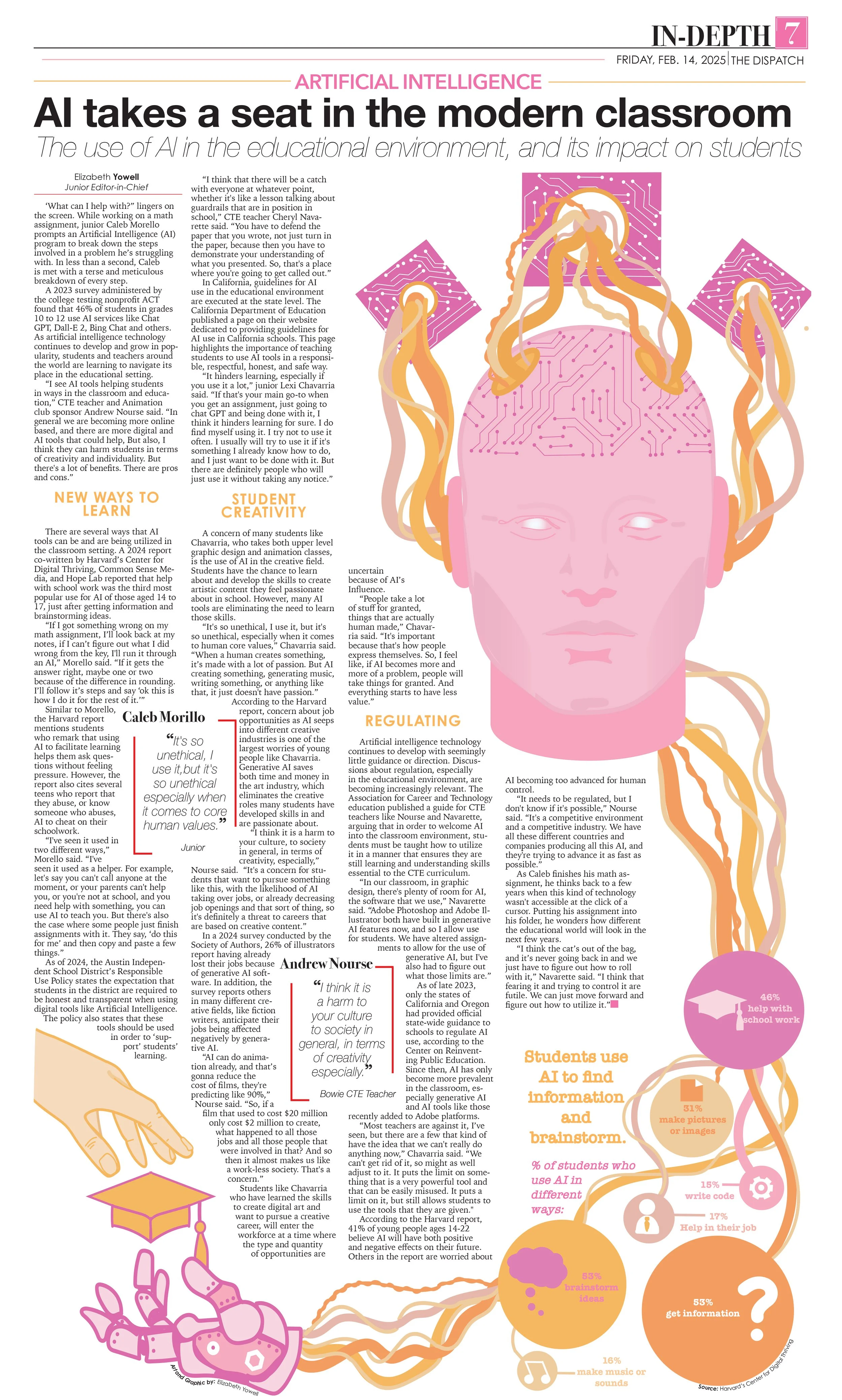
This is by far my favorite page that I’ve done, I was really excited about the story subject itself and ended up incredibly proud of the way that translated in the design. I wanted this design to encapsulate the passion and power that are present in music and protest. An advantage I have when designing is being able to create my own art and graphics for the page, this allows me to have more freedom. Here I used that advantage to combine iconic symbols of protest and music.
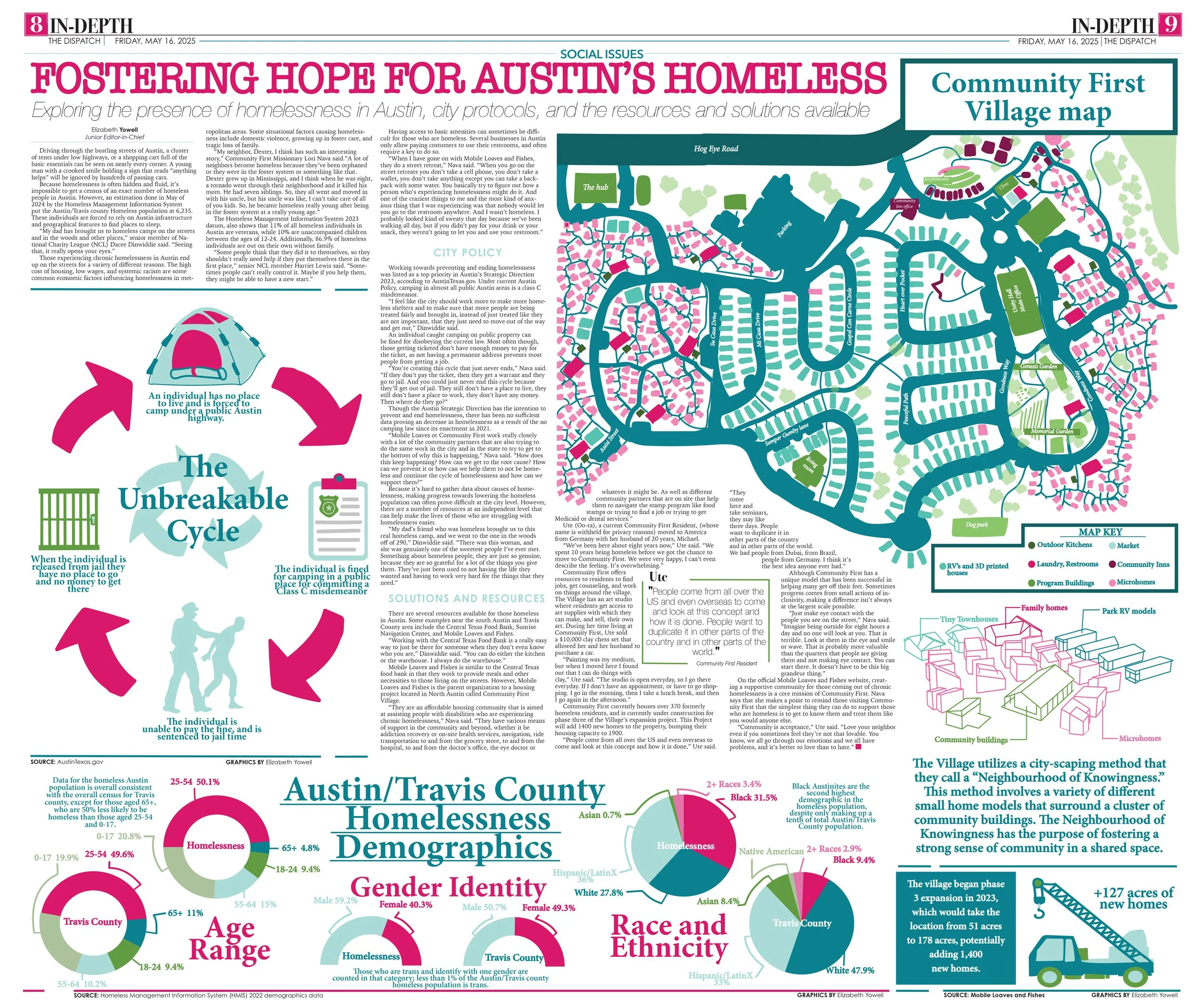
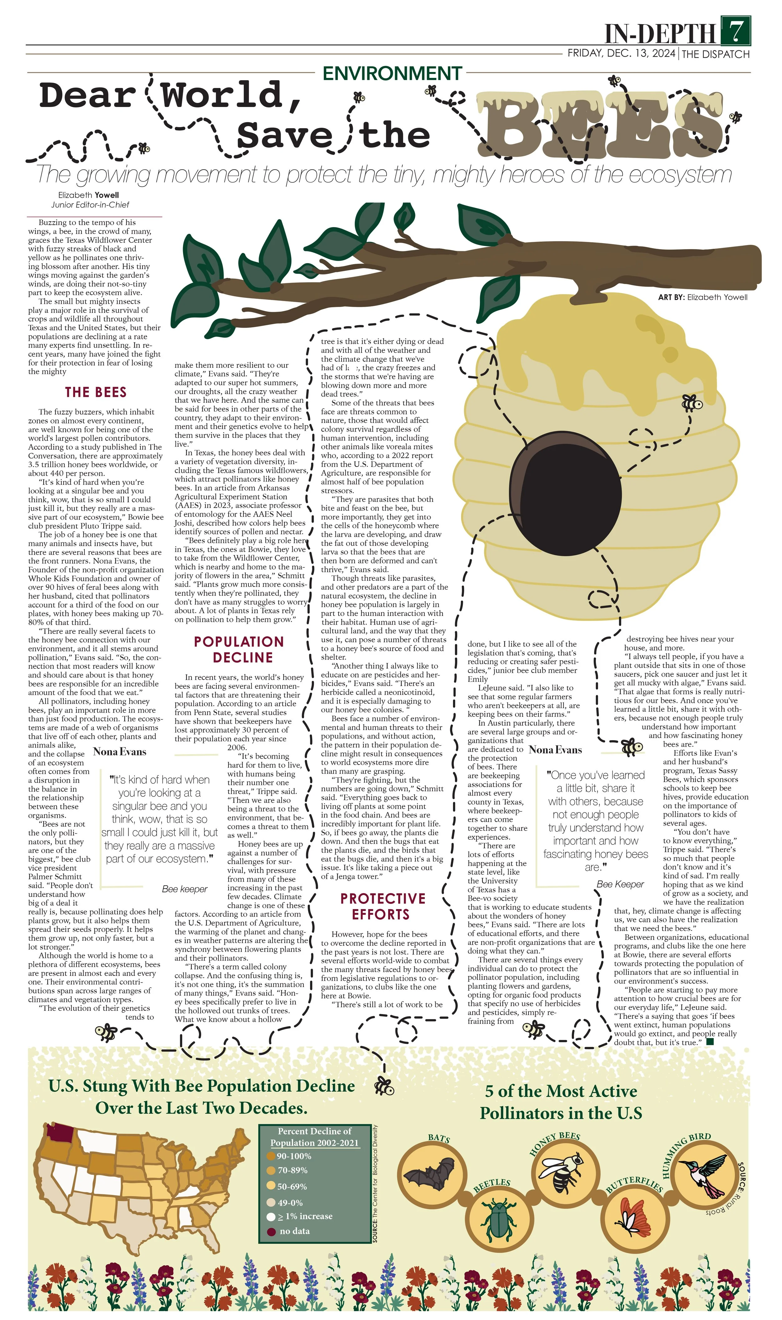
This story was one incredibly close to my heart and it was very important to me that I cover it with as much heart as possible and driving home that solutions journalism that makes me unique as a reporter. I wanted to convey that sense of hope in my design as much as in my story and I did that with hard-hitting infographics detailing the unique and impactful work of the non-profit Community First Village.
Vol 37, Issue # 2
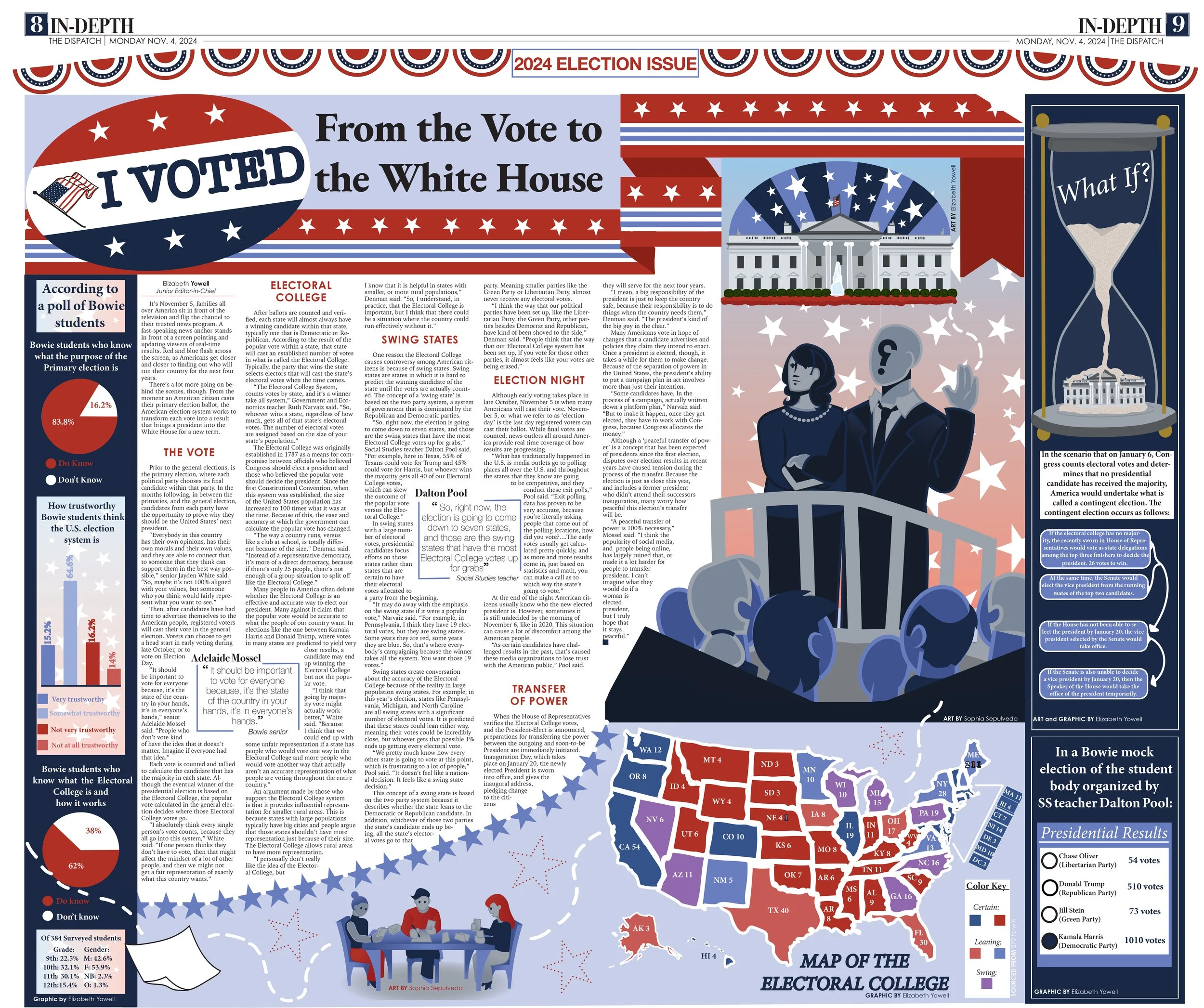
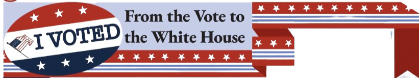
This page was a little bit different for me, as it was the first where I didnt create all of the art and graphics. I worked closely with one of our very talented digital artists to make sure my vision for the page could come to life. I wanted the design of this page to explicitly reflect the content of the story; a timeline of the presidential election process. I wanted to create a visual representation of each step of the process detailed in my story. I’m most proud of this page’s flow and ability to draw reader’s eyes to every corner of the page.
Vol 38, Issue # 3
Vol 37, Issues #3 & #4
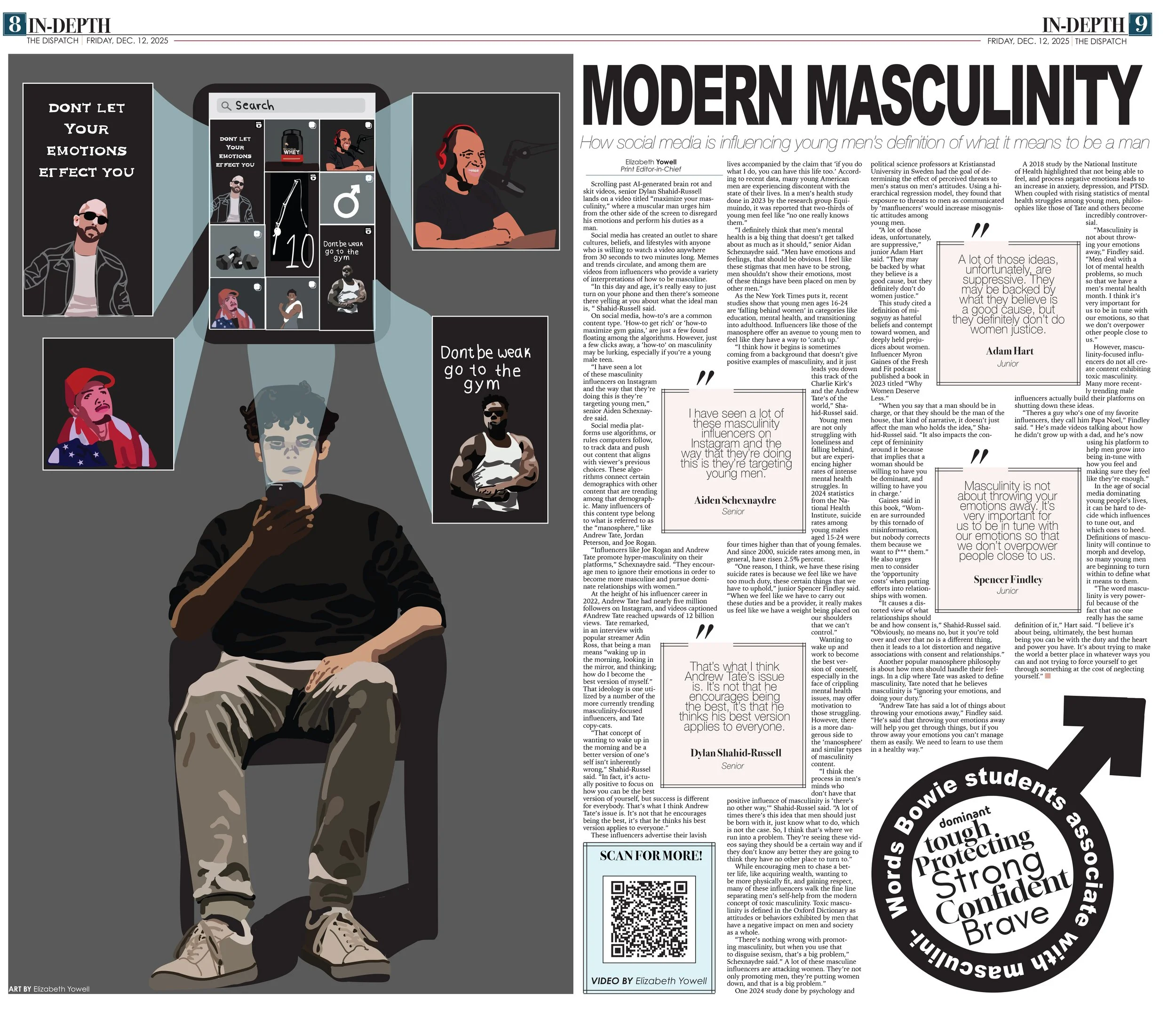
Vol 38, Issue # 4
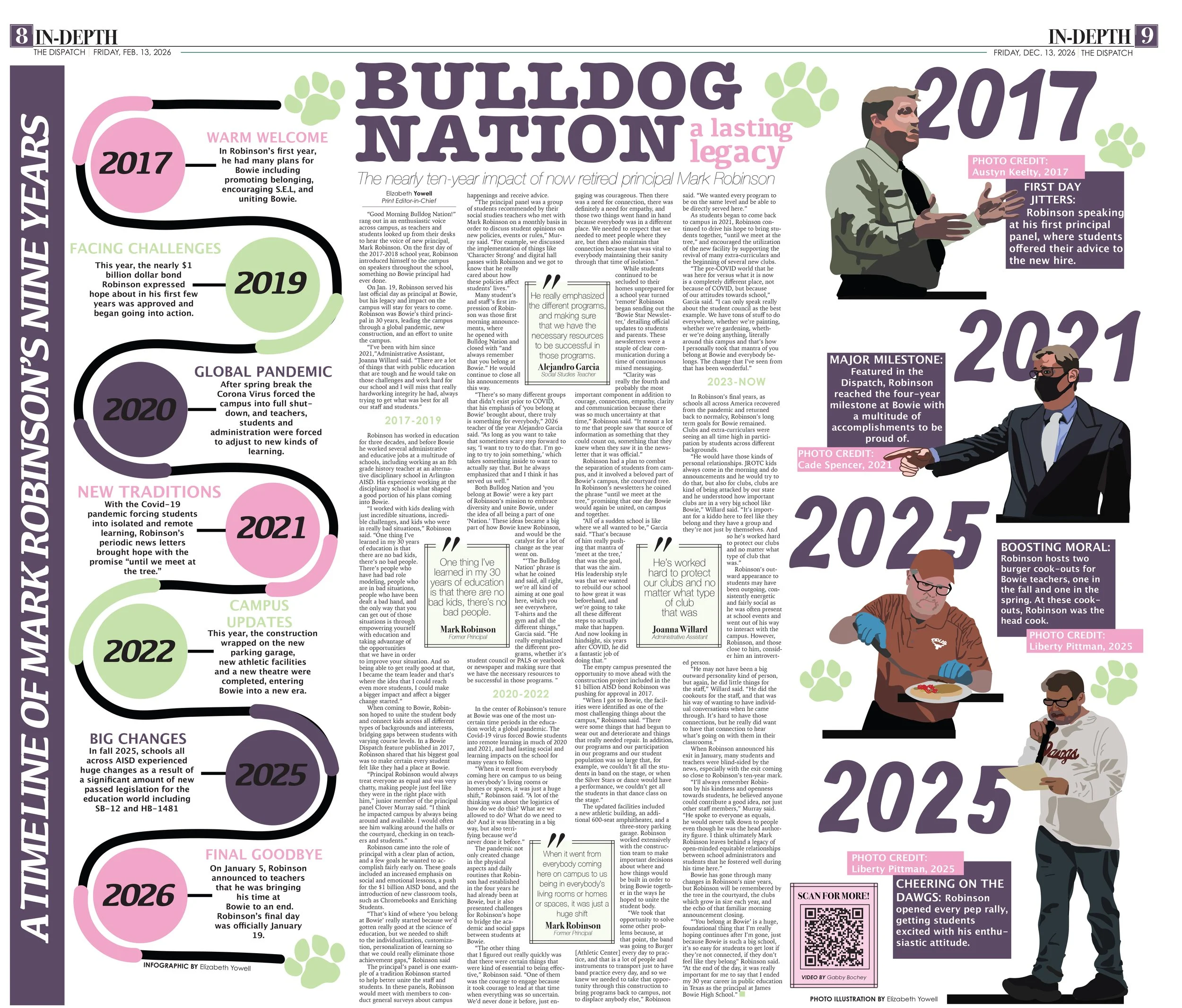
Vol 38, Issue # 2
Vol 37, Issue # 6
DESIGN ELEMENTS
3
4

Design elements; Trial and Error
1
2
As a two-year EIC, I have ample experience experimenting with design elements. Our print edition has had a concrete, iconic, look for long before I came to Bowie, but in the summer before my first year as an EIC, my advisor threw around the idea of making some changes to that look.
That summer when the leadership team began planning for the 24-25 school year, we decided to add and alter some elements that on the surface seemed small, but impacted the paper’s overall look pretty significantly.
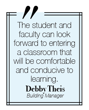
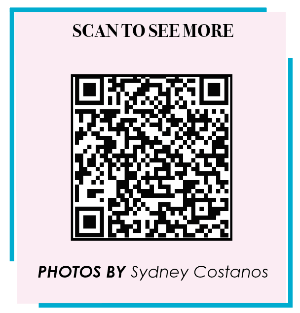
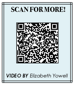
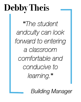
First, we all sat down to redesign both the pull quotes and the QR codes that would go on all pages (see 2). We wanted to go for a minimalist design that would engage students. Additionally, we experimented with an element our paper hadn’t yet explored, kickers (see 1).
These design elements were an interesting change, but going into the 25-26 school year, my Managing Editor and I discussed a few issues with the way they impacted our paper. Pull quotes and QR codes serve a very important purpose, to break text. With the new ‘minimalistic’ designs, the pull quotes and QR codes weren’t accomplishing this as effectively as we’d hoped. So, we decided to move back to our Designs (see 3).
However, we still wanted to leave our mark on the paper with an element that was truly our own. So, for the 25-26 my Managing Editor and I introduced mug shots (see 4), a visual element that could be used to break text and would give readers of the paper a face to the name of people quoted in each story.
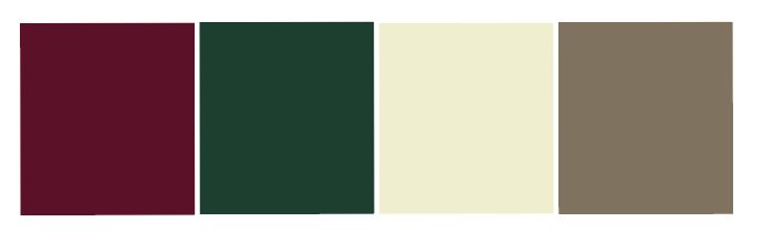
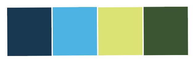
Color Palettes
As the Print Editor-In-Chief for the 25-26 school year, I have the responsibility of creating the templates before each issue (see Editing, Leadership, and Team building for more), this includes deciding on a color palette for the paper to ensure the design elements are cohesive across all 16 pages. To the right are four of the color palettes I designed. To see how the colors appear across design elements in our paper click on the palettes.


Creative Headlines
In my junior year I designed my first center-spread in our paper’s special election issue. I was nervous to take it on as I had only worked on the in-depth pages thus far. My biggest concern design wise was with giant and daunting body of text. One thing my advisor prompted me with was “what’s the first thing people see when they see a page.” This question has two answers; one, of course, is the visual elements on a page, and secondly, the headline: what the story is about. I wanted people to want to read my monster of a story on this double truck, not just to look at the art and flip past. So I decided to experiment combining strong visual elements with the headline, to draw the readers to the subject of the story with their eyes and be encouraged to keep reading.
Closing thoughts
Designing pages has been one of my favorite parts about being on newspaper, especially since the way The Dispatch does things allows a lot of freedom when it comes to design choices. I’ve loved being able to grow as a digital artist and designer and I’m proud of my design portfolio up to this point. I’m confident my experience in digital design will open up many opportunities in the future and I hope to continue developing my skills in higher education and beyond.
Awards:
Southern Interscholastic Press Association (SIPA)
2cd place Newspaper design portfolio
1st place newspaper center spread
Texas Association of Journalism Educators (TAJE) (State)
1st place best of the best in texas, Print Portfolio
3rd place print design
Superior alternative copy 1
Superior alternative copy 2
Superior double truck design
Interscholastic League Press Association 2024-25 Individual Achievement (ILPC IA) (State)
1st place digital infographics/sidebar
1st place Infographic/sidebar